

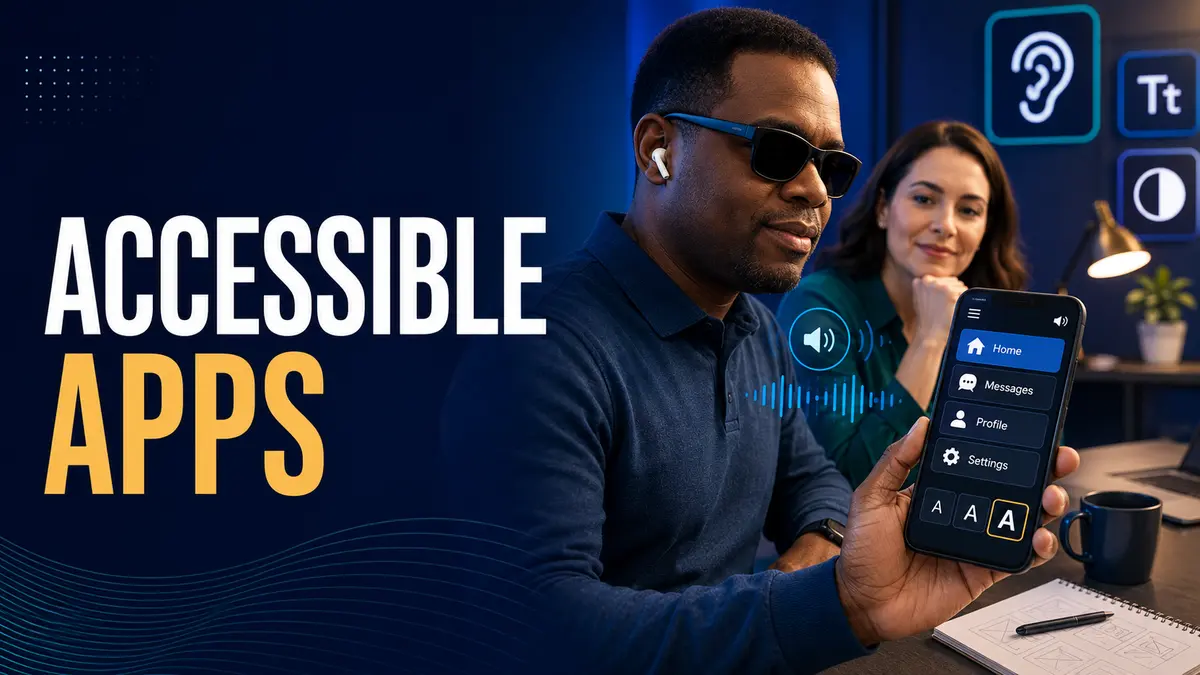
Quick answer Visually impaired apps should be designed so users can understand, navigate and complete every important journey without depending on sight alone. Use meaningful labels, logical reading order, strong contrast, scalable text, clear focus, large controls and alternatives for visual information. Test with screen readers, platform accessibility tools and people with different visual abilities. Accessibility should begin during product discovery and continue through design, development, quality assurance and future releases.
Visual impairment includes blindness, low vision, color vision differences and changing vision related to age or health. One interface will not serve every person in the same way, so products should work with platform settings and assistive technology.
Identify the tasks users need to complete, the environments where the app will be used and the assistance they may rely on. Interview users and accessibility specialists before fixing the interface.
Prioritize complete journeys such as account creation, search, purchase, communication and support. Making individual screens accessible is not enough if the full workflow breaks.
The Web Content Accessibility Guidelines 2.2 organize accessibility around content that is perceivable, operable, understandable and robust. These principles provide a useful foundation for web and mobile product decisions.
Platform guidance should also shape implementation. Requirements and testing need to reflect the actual controls, navigation patterns and assistive services used on each device.
Headings, groups, lists and controls need clear relationships that assistive technology can understand. Visual position alone should not communicate meaning.
Keep reading and focus order logical. When a dialog or new panel appears, move focus intentionally and return it appropriately when the element closes.
Buttons, fields and icons need accessible names that explain what they do. Avoid labels such as button or image when a specific action can be described.
Visible labels and screen reader names should agree. Add useful state information for controls such as selected tabs, expanded sections and active switches.
Test important journeys with platform screen readers, including TalkBack and VoiceOver. Users should be able to move through content, discover available actions, enter data and understand status changes.
Official Android accessibility principles emphasize descriptive labels, available actions, built in accessibility features and cues beyond color. Equivalent platform practices should be included in the acceptance criteria.
Use readable text, sufficient spacing and layouts that remain useful when text or display size increases. Avoid fixed containers that clip labels or hide actions.
Do not place essential information inside small images. Support zoom and reflow where appropriate, and ensure that enlarged content does not require confusing two direction navigation.
Text and important interface components need adequate contrast against surrounding colors. Test active, disabled, error and focus states rather than checking only the default screen.
Color should not be the only way to identify status or category. Add text, icons, patterns or position so the meaning remains available to people with color vision differences.
Interactive areas should be large enough to locate and activate reliably. Provide spacing between adjacent actions and avoid gestures that require precise movement when a simpler control can work.
Complex gestures need accessible alternatives. Users should not lose essential functionality when they navigate sequentially or use external input devices.
Validation messages should identify the affected field, explain the problem and suggest a correction. Do not use color alone or move focus without explanation.
Loading, success and background updates need announcements when they change the user task. Avoid excessive announcements that interrupt navigation and make important feedback harder to hear.
Meaningful images need concise alternatives that communicate their purpose. Decorative images should be ignored by assistive technology so they do not add noise.
Charts and diagrams need text summaries or accessible data. Video should include suitable audio description when essential visual information is not available through the soundtrack.
Sign in, verification and recovery must work with screen readers and enlarged text. Avoid puzzles or time limits that create unnecessary barriers. Explain requirements before users submit a form.
Biometric and device based options can reduce friction, but an accessible alternative must remain available when they cannot be used.
Automated tools can find missing labels, contrast issues and some structural problems. They cannot judge whether the journey makes sense or whether announcements are useful.
Android guidance for testing app accessibility recommends manual testing, analysis tools, automated checks and user testing. Combine these methods throughout delivery.
Recruit people with different visual abilities and assistive technology experience. Give them realistic goals rather than step by step instructions and observe where the product creates unnecessary work.
Compensate participants fairly and protect their privacy. Treat findings as product evidence, not as requests from one exceptional user.
Add accessibility requirements to design reviews, component libraries, development stories and release checks. Train the team and assign clear ownership.
Our UI UX services guide explains how to evaluate design partners and inclusive delivery practices.
No. Automated tools find selected technical issues. Manual screen reader testing and feedback from users are also necessary.
No. It is faster and more reliable when included in research, design, components, development and testing from the beginning.
Often yes. Clear labels, flexible text, larger controls and predictable navigation can improve usability in many situations.
Techfusion Gear helps businesses plan, design and test mobile products with accessibility included throughout delivery. To discuss an inclusive app roadmap, contact Techfusion Gear.